 源码UI-官方
 css3实现汤勺捞起汤圆的动画特效(超可爱)
祝各位学员元宵节快乐!!!今天给大家送上一碗热腾腾的汤圆,美味可口~完整的特效源码及图片链接在文末,点击预览下载即可使用!
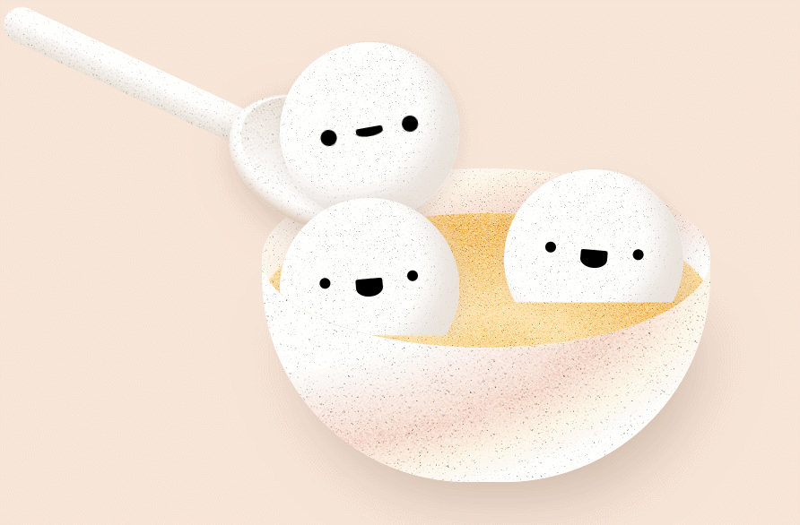
本文特效是基于css3绘制的一碗可爱的汤圆表情,汤勺捞起一个汤圆动画特效。
HTML代码:
<!DOCTYPE html>
<html lang="en" >
<head>
<meta charset="UTF-8">
<title>汤勺捞起汤圆动画</title>
<link rel="stylesheet" href="css/style.css">
</head>

<body>

<div class="bowl">
  <div class="back"></div>
  <div class="spoon">
    <div class="scoop"></div>
  </div>
  <div class="contents">
    <div class="syrup"></div>
    <div class="riceball uno">
      <div class="face"></div>
    </div>
    <div class="riceball dos">
      <div class="face"></div>
    </div>
    <div class="riceball tres">
      <div class="face"></div>
    </div>
  </div>
</div>

</body>
</html>
style.css代码:
html,
body {
  width: 100%;
  height: 100%;
  margin: 0;
  padding: 0;
  overflow: hidden;
}

body {
  background: #f7e5d7;
}

.riceball {
  position: absolute;
  width: 200px;
  height: 200px;
  background: #fff;
  border-radius: 50%;
  background: url("../img/1.jpg") 0 0/10em 10em, #fff;
  background-blend-mode: hard-light;
  box-shadow: inset -25px -25px 25px rgba(229, 219, 211, 0.8), 5px 5px 15px 5px rgba(216, 200, 190, 0.3);
  -webkit-clip-path: inset(-40px -30px 25% -20px);
          clip-path: inset(-40px -30px 25% -20px);
}
.riceball .face {
  position: absolute;
  top: 50%;
  left: 50%;
  -webkit-transform: translate(-50%, -50%) rotate(5deg);
          transform: translate(-50%, -50%) rotate(5deg);
  width: 30px;
  height: 20px;
  background: #000;
  border-radius: 50%;
  border-top-left-radius: 3px;
  border-top-right-radius: 3px;
}
.riceball .face::before, .riceball .face::after {
  display: block;
  content: "";
  position: absolute;
  top: -5px;
  width: 12px;
  height: 12px;
  background: #000;
  border-radius: 50%;
}
.riceball .face::before {
  left: -40px;
}
.riceball .face::after {
  right: -40px;
}
.riceball.uno {
  left: 150px;
  bottom: 65px;
  -webkit-animation: 3s rice-up infinite;
          animation: 3s rice-up infinite;
}
.riceball.uno .face {
  -webkit-transform: translate(-50%, -50%) rotate(-20deg);
          transform: translate(-50%, -50%) rotate(-20deg);
  -webkit-animation: 3s face-bob infinite;
          animation: 3s face-bob infinite;
}
.riceball.uno .face::before, .riceball.uno .face::after {
  -webkit-animation: 3s eye-bulge infinite;
          animation: 3s eye-bulge infinite;
}
.riceball.dos {
  left: 20px;
  bottom: -35px;
  -webkit-animation: 1s little-bob1 linear infinite;
          animation: 1s little-bob1 linear infinite;
}
.riceball.dos .face {
  -webkit-transform: translate(-50%, -50%) rotate(-5deg);
          transform: translate(-50%, -50%) rotate(-5deg);
}
.riceball.tres {
  bottom: 0;
  right: 30px;
  -webkit-animation: 1.2s little-bob2 linear infinite;
          animation: 1.2s little-bob2 linear infinite;
}

.syrup {
  position: absolute;
  bottom: -50px;
  width: 500px;
  height: 200px;
  border-radius: 50%;
  background: url("../img/1.jpg") 0 0/10em 10em, radial-gradient(ellipse at bottom center, #f0ad42 0%, #feda90 31%, #f0ad42 66%, #feda90 86%, #f0ad42 100%);
  background-blend-mode: hard-light;
}

.bowl {
  position: absolute;
  top: calc(50% + 100px);
  left: 50%;
  -webkit-transform: translate(-50%, -50%);
          transform: translate(-50%, -50%);
  width: 500px;
  height: 250px;
  background: url("../img/1.jpg") 0 0/15em 15em, radial-gradient(ellipse at top left, #fff 0%, #fcfcfc 35%, #f1ccbb 60%, #fdf1dd 70%, #fff 80%);
  background-blend-mode: hard-light;
  border-bottom-left-radius: 230px;
  border-bottom-right-radius: 230px;
  box-shadow: 15px 40px 80px -30px #C5AE9F;
}

.back {
  position: absolute;
  top: -100px;
  width: 500px;
  height: 200px;
  border-radius: 50%;
  background: url("../img/1.jpg") 0 0/10em 10em, radial-gradient(ellipse at bottom right, #fff 0%, #fcfcfc 35%, #f1ccbb 60%, #fdf1dd 75%, #fff 90%);
  background-blend-mode: hard-light;
}

.contents {
  position: fixed;
  bottom: 150px;
  width: 500px;
  height: 400px;
  border-bottom-left-radius: 50% 100px;
  border-bottom-right-radius: 50% 100px;
  border-top-left-radius: 0;
  border-top-right-radius: 0;
  overflow: hidden;
}

.spoon {
  position: absolute;
  top: -60%;
  left: -200px;
  -webkit-transform: rotate(25deg);
          transform: rotate(25deg);
  width: 300px;
  height: 40px;
  background: url("../img/1.jpg") 0 0/5em 10em, linear-gradient(to bottom, #fff 40%, #e2d7cb 100%);
  background-blend-mode: hard-light;
  border-top-left-radius: 20px;
  border-bottom-left-radius: 20px;
  -webkit-animation: spoon-up 3s infinite;
          animation: spoon-up 3s infinite;
}
.spoon .scoop {
  position: absolute;
  top: 50%;
  right: -200px;
  -webkit-transform: translateY(-50%);
          transform: translateY(-50%);
  width: 220px;
  height: 140px;
  border-radius: 50%;
  background: url("../img/1.jpg") 0 0/10em 10em, #fff;
  background-blend-mode: hard-light;
  box-shadow: inset -10px -5px 15px #ceb499, 10px 10px 50px -10px #C5AE9F;
}
.spoon .scoop::before {
  display: block;
  content: "";
  position: absolute;
  top: 2px;
  left: 50%;
  -webkit-transform: translateX(-50%);
          transform: translateX(-50%);
  width: 200px;
  height: 120px;
  background: url("../img/1.jpg") 0 0/10em 10em, linear-gradient(to bottom, #e2d7cb 20%, #fff 100%);
  background-blend-mode: hard-light;
  border-radius: 50%;
}

@-webkit-keyframes spoon-up {
  0% {
    top: -60%;
    left: -200px;
  }
  25% {
    top: -80%;
    -webkit-transform: rotate(15deg);
            transform: rotate(15deg);
  }
  50% {
    top: -90%;
    left: -300px;
    -webkit-transform: rotate(25deg);
            transform: rotate(25deg);
  }
  100% {
    top: -60%;
    left: -200px;
    -webkit-transform: rotate(25deg);
            transform: rotate(25deg);
  }
}

@keyframes spoon-up {
  0% {
    top: -60%;
    left: -200px;
  }
  25% {
    top: -80%;
    -webkit-transform: rotate(15deg);
            transform: rotate(15deg);
  }
  50% {
    top: -90%;
    left: -300px;
    -webkit-transform: rotate(25deg);
            transform: rotate(25deg);
  }
  100% {
    top: -60%;
    left: -200px;
    -webkit-transform: rotate(25deg);
            transform: rotate(25deg);
  }
}
@-webkit-keyframes rice-up {
  0% {
    left: 150px;
    bottom: 65px;
    -webkit-clip-path: inset(-40px -30px 25% -20px);
            clip-path: inset(-40px -30px 25% -20px);
  }
  25% {
    bottom: 160px;
    -webkit-clip-path: inset(-40px -30px 0 -20px);
            clip-path: inset(-40px -30px 0 -20px);
  }
  50% {
    left: 20px;
    bottom: 140px;
    -webkit-clip-path: inset(-40px -30px 0 -20px);
            clip-path: inset(-40px -30px 0 -20px);
  }
  55% {
    -webkit-clip-path: inset(-40px -30px 0 -20px);
            clip-path: inset(-40px -30px 0 -20px);
  }
  100% {
    left: 150px;
    bottom: 65px;
    -webkit-clip-path: inset(-40px -30px 25% -20px);
            clip-path: inset(-40px -30px 25% -20px);
  }
}
@keyframes rice-up {
  0% {
    left: 150px;
    bottom: 65px;
    -webkit-clip-path: inset(-40px -30px 25% -20px);
            clip-path: inset(-40px -30px 25% -20px);
  }
  25% {
    bottom: 160px;
    -webkit-clip-path: inset(-40px -30px 0 -20px);
            clip-path: inset(-40px -30px 0 -20px);
  }
  50% {
    left: 20px;
    bottom: 140px;
    -webkit-clip-path: inset(-40px -30px 0 -20px);
            clip-path: inset(-40px -30px 0 -20px);
  }
  55% {
    -webkit-clip-path: inset(-40px -30px 0 -20px);
            clip-path: inset(-40px -30px 0 -20px);
  }
  100% {
    left: 150px;
    bottom: 65px;
    -webkit-clip-path: inset(-40px -30px 25% -20px);
            clip-path: inset(-40px -30px 25% -20px);
  }
}
@-webkit-keyframes face-bob {
  0% {
    -webkit-transform: translate(-50%, -50%) rotate(10deg);
            transform: translate(-50%, -50%) rotate(10deg);
  }
  50% {
    height: 10px;
    -webkit-transform: translate(-50%, -50%) rotate(-10deg);
            transform: translate(-50%, -50%) rotate(-10deg);
  }
  100% {
    -webkit-transform: translate(-50%, -50%) rotate(10deg);
            transform: translate(-50%, -50%) rotate(10deg);
  }
}
@keyframes face-bob {
  0% {
    -webkit-transform: translate(-50%, -50%) rotate(10deg);
            transform: translate(-50%, -50%) rotate(10deg);
  }
  50% {
    height: 10px;
    -webkit-transform: translate(-50%, -50%) rotate(-10deg);
            transform: translate(-50%, -50%) rotate(-10deg);
  }
  100% {
    -webkit-transform: translate(-50%, -50%) rotate(10deg);
            transform: translate(-50%, -50%) rotate(10deg);
  }
}
@-webkit-keyframes eye-bulge {
  0% {
    width: 12px;
    height: 12px;
  }
  50% {
    width: 18px;
    height: 18px;
  }
  100% {
    width: 12px;
    height: 12px;
  }
}
@keyframes eye-bulge {
  0% {
    width: 12px;
    height: 12px;
  }
  50% {
    width: 18px;
    height: 18px;
  }
  100% {
    width: 12px;
    height: 12px;
  }
}
@-webkit-keyframes little-bob1 {
  0% {
    bottom: -35px;
    -webkit-clip-path: inset(-40px -30px 25% -20px);
            clip-path: inset(-40px -30px 25% -20px);
  }
  50% {
    bottom: -33px;
    -webkit-clip-path: inset(-40px -30px 23% -20px);
            clip-path: inset(-40px -30px 23% -20px);
  }
  100% {
    bottom: -35px;
    -webkit-clip-path: inset(-40px -30px 25% -20px);
            clip-path: inset(-40px -30px 25% -20px);
  }
}
@keyframes little-bob1 {
  0% {
    bottom: -35px;
    -webkit-clip-path: inset(-40px -30px 25% -20px);
            clip-path: inset(-40px -30px 25% -20px);
  }
  50% {
    bottom: -33px;
    -webkit-clip-path: inset(-40px -30px 23% -20px);
            clip-path: inset(-40px -30px 23% -20px);
  }
  100% {
    bottom: -35px;
    -webkit-clip-path: inset(-40px -30px 25% -20px);
            clip-path: inset(-40px -30px 25% -20px);
  }
}
@-webkit-keyframes little-bob2 {
  0% {
    bottom: 0;
    -webkit-clip-path: inset(-40px -30px 25% -20px);
            clip-path: inset(-40px -30px 25% -20px);
  }
  50% {
    bottom: -2px;
    -webkit-clip-path: inset(-40px -30px 26% -20px);
            clip-path: inset(-40px -30px 26% -20px);
  }
  100% {
    bottom: 0;
    -webkit-clip-path: inset(-40px -30px 25% -20px);
            clip-path: inset(-40px -30px 25% -20px);
  }
}
@keyframes little-bob2 {
  0% {
    bottom: 0;
    -webkit-clip-path: inset(-40px -30px 25% -20px);
            clip-path: inset(-40px -30px 25% -20px);
  }
  50% {
    bottom: -2px;
    -webkit-clip-path: inset(-40px -30px 26% -20px);
            clip-path: inset(-40px -30px 26% -20px);
  }
  100% {
    bottom: 0;
    -webkit-clip-path: inset(-40px -30px 25% -20px);
            clip-path: inset(-40px -30px 25% -20px);
  }
}
运行效果:

下载说明:
1.本站资源都是白菜价出售,同样的东西,我们不卖几百,也不卖几十,甚至才卖几块钱,一个永久会员能下载全站100%源码了,所以单独购买也好,会员也好均不提供相关技术服务。
2.如果源码下载地址失效请/联系站长QQ进行补发。
3.本站所有资源仅用于学习及研究使用,请必须在24小时内删除所下载资源,切勿用于商业用途,否则由此引发的法律纠纷及连带责任本站和发布者概不承担。资源除标明原创外均来自网络整理,版权归原作者或本站特约原创作者所有,如侵犯到您权益请联系本站删除!
4.本站站内提供的所有可下载资源(软件等等)本站保证未做任何负面改动(不包含修复bug和完善功能等正面优化或二次开发);但本网站不能保证资源的准确性、安全性和完整性,用户下载后自行斟酌,我们以交流学习为目的,并不是所有的源码都100%无错或无bug;同时本站用户必须明白,【源码源码ui网】对提供下载的软件等不拥有任何权利(本站原创和特约原创作者除外),其版权归该资源的合法拥有者所有。
5.请您认真阅读上述内容,购买即以为着您同意上述内容。
源码UI网 » css3实现汤勺捞起汤圆的动画特效(超可爱)